What is seaborn.pointplot?
“Seaborn is a widely used library for the visualization of statistical plots in python.” – source
Its simple API makes life easier and allows plots to be created in a timely manner. Seaborn offers a variety of color palettes and statistical styles that make plots more appealing. Since it is built on top of the matplotlib.pyplot library, Seaborn can easily be linked with libraries like pandas.
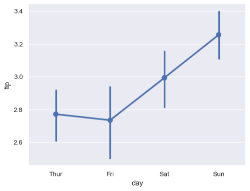
A point plot uses scatter plot glyphs to visualize features like point estimates and confidence intervals. A point plot uses scatter plot points to represent the central tendency of numeric data.These plots make use of error bars to indicate any uncertainty around the numeric variables.
When data is of numeric type, one of the variables is always treated as a categorical type. The data is drawn at ordinal points (0, 1, …n).
Syntax
seaborn.pointplot(
x=None,
y=None,
hue=None,
data=None,
markers='o',
linestyles='-',
color=None,
capsize=None)
Parameters
x: Data for x-axis. There is no specified type for x. It is important to define it if someone is looking for data to be interpreted as
y: Data for y-axis. There is no specified type for y. It is important to define it if someone is looking for data to be interpreted as long-form.
hue: Another one of the inputs for plotting any type of long-form data. This parameter is used to determine the column that will be used for color encoding.
data: Dataset that is to used for plotting. The format of data can include:
- Array/ list of vectors.
- Vectors of data in the form of lists, numpy arrays, or pandas series objects.
- A pandas DataFrame. However, it is important to define the
x,y, andhuevariables in order to easily identify how data should be plotted from DataFrame.
color: Optional Parameter. Refers to the individual color of all elements for a gradient palette.
markers: Optional Parameter. Refers to the markers that may be used for hue levels. It takes a string of a list of strings as an input.
linestyles: Optional Parameter. Refers to the line stylings that may be used for hue levels. The followrin are a few of the most commonly used linestyles:
'-' ==> solid line style
'--' ==> dashed line style
'-.' ==> dash-dot line style
':' ==> dotted line style
capsize: Optional parameter. Refers to the size of width of the error bar caps. Takes input as a float value referring to the width of error bar caps.
Code
Lets draw a few point plots with Iris dataset.
You can always add title, xlabel, ylabel using matplotlib functions,
plt.xlabel,plt.ylabel,plt.title.
import seaborn as snsimport matplotlib.pyplot as pltdf = sns.load_dataset('iris')sns.pointplot(y="sepal_length", x="species", data=df)# x labelplt.xlabel("species")# y labelplt.ylabel("sepal length")plt.show()
Let’s this try with a different field in y and some different styling:
import seaborn as snsimport matplotlib.pyplot as pltdf = sns.load_dataset('iris')# using `^` as markets.sns.pointplot(y="sepal_width", x="species", linestyles = '-.',markers = '^', data=df)plt.show()
Free Resources

