What is ClipRRect in Flutter?
The ClipRRect class in Flutter provides us with a widget that clips its child using a rounded rectangle. The extra R in clipRRect stands for rounded.
By default, this class uses its own boundaries for the clip as the base rectangle. We can also customize the size and location of the bounded clip using the custom clipper.
Properties
The ClipRRect class has the following properties, which are widely used in Flutter application development:
Border Radius: This feature specifies the border radius of the rounded corners of rectangle.child: Inchild, we specify the widget to be placed inside theClipRRectwidget.clipBehavior: It specifies how to control the clip. It must not be set tonull.clipper: It specifies which clip to use.
Now, let’s create a new Flutter application named cliprrect_flutter. We will make the changes inside the main.dart file. The code for the main.dart file is given below:
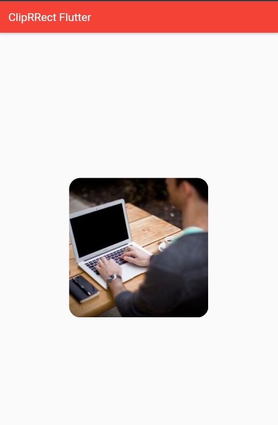
import 'package:flutter/material.dart';void main() {runApp(const MyApp());}class MyApp extends StatelessWidget {const MyApp({Key? key}) : super(key: key);@overrideWidget build(BuildContext context) {return MaterialApp(title: 'Flutter Demo',debugShowCheckedModeBanner: false,theme: ThemeData(primarySwatch: Colors.blue,),home: const MyHomePage(title: 'Flutter Demo Home Page'),);}}class MyHomePage extends StatefulWidget {const MyHomePage({Key? key, required this.title}) : super(key: key);final String title;@overrideState<MyHomePage> createState() => _MyHomePageState();}class _MyHomePageState extends State<MyHomePage> {@overrideWidget build(BuildContext context) {return Scaffold(appBar: AppBar(title: Text('ClipRRect Flutter'),backgroundColor: Colors.red,),body: Center(child: ClipRRect(borderRadius:BorderRadius.circular(20),child: Image.network('https://picsum.photos/250?image=1'),),));}}class MyClip extends CustomClipper<Rect> {Rect getClip(Size size) {return Rect.fromLTWH(0, 0, 100, 100);}bool shouldReclip(oldClipper) {return false;}}
The output of the above code is as follows:
You can find the complete