How to use Font Awesome 5 in React
Font Awesome went all out with new version 5, adding a wide variety of SVG icons and providing users with new features.
If you’ve worked with Font Awesome in the past, something like fa-profile might look familiar. Font Awesome introduced icon styles like fas for Font Awesome solid, fal for Font Awesome Light, etc. This adds a great deal of flexibility for UI/UX design.
Additionally, there are Font Awesome packages (like the one we will use!) for React, Angular, and Vue.
Installation
To get started, we’re going to install react-fontawesome along with their libraries.
If you are using npm:
$ npm install @fortawesome/react-fontawesome @fortawesome/fontawesome-svg-core @fortawesome/free-solid-svg-icons
If you are using yarn:
$ yarn add @fortawesome/react-fontawesome @fortawesome/fontawesome-svg-core @fortawesome/free-solid-svg-icons
The packages that we are introducing contain the free version. If you’re looking to utilize new pro icons and styles, look at their site for additional installation and setup directions.
Implementation
Let’s move forward to implement these beautiful icons throughout our app.
There are numerous approaches to utilizing these symbols; however, we will focus on building a library to get to all the symbols effortlessly.
The following code, that we use to add icons to the library, can be done at the root level of our application, i.e., App.js. We will start by importing the required files and calling fontawesome-svg-core’s library.add to pull our icons.
//App.js

import { library } from "@fortawesome/fontawesome-svg-core";
import { faCheckSquare, faMugHot } from "@fortawesome/free-solid-svg-icons";

library.add( faCheckSquare, faMugHot);

//...
All icons can be found in Font Awesome’s icon library.
We have successfully added the icons we need. Now, it’s time to implement it in our component.
Imagine that we have a component called Icon.js. Since they have already been added to our library in App.js, we need to import the following:
// Icon.js
import React from 'react'
import { FontAwesomeIcon } from '@fortawesome/react-fontawesome'
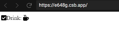
export const Drink = () => (
<div className="App">
<div>
<FontAwesomeIcon icon="check-square" />
Drink: <FontAwesomeIcon icon="mug-hot" />
</div>
</div>
)
By adding faCheckSquare and faMugHot to the library, we can refer to them throughout the app with the lowercase icon string names, check-square and mug-hot.
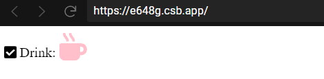
Wait…I think our icons and text are a little squished and, I might venture to say, boring. So, let’s add a space between the icon and the text, and change the icon’s color and size:
<FontAwesomeIcon icon="check-square" />{' '}
Drink: <FontAwesomeIcon icon="mug-hot" color="pink" size="2x" />
As you can see, the FontAwesomeIcon component can take a few different props to change the icon style. Here, we used the color and size props. The size prop expects a string value like xs, lg, 2x, 3x, and so on.
There are quite a few more props that can be passed in. Notably, the rotation and pulse boolean props will have the icon rotate on itself.
Note: Don’t use the CDN link of FontAwesome in your index.html file. It will decrease the performance of your site.
Conclusion
That’s all. Hurray🎉, you did it. The process is pretty straightforward, so you can easily implement this in your app. Do give it a try; you will definitely love it 😍.
Thanks for reading!
Free Resources