How to make your first CSS art
Many people know how to use CSS to style websites, but when it comes to CSS artwork, they get confused about how they are made.
So, I thought it might be helpful if I share my humble experience with you. In this article, I am going to discuss some important CSS knowledge you will need to have in order to make your own CSS art and enjoy it as I do, let’s start.🚀
Useful CSS properties
1. Gradient
We can declare gradient in both background or background-image properties – it can take as many colors as you want as long as they are separated by a comma “ , ”.
We have two types of gradients:
-
Linear Gradients: can be controlled by directions(left,top,right,bottom) or angles.
-
Radial Gradients: can be controlled by giving each color a percentage or setting a shape(circle, ellipse).
Great website to generate gradients: cssgradient
2. box-shadow
Give your element one or more shadows by separating them with a comma “ , ”.
I’ve found that the “inset” property value is very useful as it changes the shadow from an outer shadow to an inner shadow, which makes your element looks a little bit real.
Great website to generate box-shadow: cssmatic
3. clip-path
Clip-path is a very useful property when it comes to CSS artwork. This property makes it easy to draw a path that would probably take you a lot of time if you did it in a different way.
Clip-path helps to draw circles, polygons, and paths by specifying which region you want to show.
Great website to generate clip-path: bennettfeely
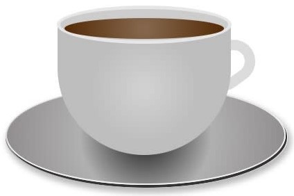
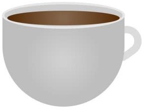
Make your first CSS art
Now that we’ve discussed the properties above, you are ready to make your first CSS art.
This is the one we will make together 😍
Here is the HTML:
<div>
    <div></div>
    <div></div>
    <div></div>
</div>
The first thing we need do is style our coffee container: we will give it position:relative and give position:absolute to the other elements inside this div (except the coffee-cup div ) so that their positions depend on their parent’s position.
.coffee-cont {
    width: 500px;
    height: 500px;
    margin: 0 auto;
    position: relative;
}
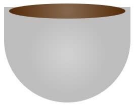
Let’s style our second div, the coffee cup. To do this we will use the radial-gradient for the background to make the center a little bit brighter than the sides.
.coffee-cup {
    position: relative;
    width: 250px;
    height: 190px;
    margin: 0 auto;
    background: radial-gradient(circle,rgba(208, 208, 208, 1) 5%,rgba(189, 189, 189, 1) 51%);
    border-radius: 0 0 150px 150px;
    top: 50%;
}
Again, we will add a radial-gradient to the element before the coffee-cup to generate our coffee’s color. Notice that we give it z-index:9 so that it goes over the cup.
.coffee-cup::before {
    content: '';
    display: block;
    height: 30px;
    width: 230px;
    position: absolute;
    border-radius: 50%;
    background: radial-gradient(circle,rgba(132, 102, 76, 1) 5%,rgba(86, 44, 8, 1) 96%);
    top: -7px;
    left: 10px;
    z-index: 9;
}
Here is the code to generate the top of the cup:
.coffee-cup::after{
    content: '';
    display: block;
    height: 45px;
    width: 242px;
    position: absolute;
    border-radius: 50%;
    background: #cccccc;
    top: -25px;
    left: -1px;
    border: 5px solid #e6e6e6;
}
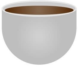
Let’s add the coffee-hand div, we will give it z-index:-1 so that it goes behind the cup element.
.coffee-hand{
    width: 52px;
    height: 32px;
    position: absolute;
    background: #ffffff;
    border-radius: 32px;
    transform: rotate(-36deg);
    z-index: -1;
    border: 15px solid #dbdbdb;
    top: 56%;
    left: 66%;
}
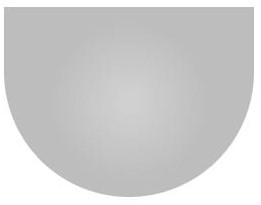
Now we need to take care of the element in the bottom. For this, we will use a circular radial-gradient to make the center brighter. We also need a shadow to add a nice effect to this element; for this, we will use the box-shadow property with a darker color.
.coffee-tasse{
    width: 400px;
    top: 68%;
    left: 10%;
    height: 139px;
    background: radial-gradient(circle,rgba(69, 69, 69, 1) 13%,rgba(176, 176, 176, 1) 45%,rgba(143, 141, 141, 1) 96%);
    border-radius: 50%;
    position: absolute;
    z-index: -1;
    border: 2px solid #f0f0f0;
    box-shadow: 1px 3px 0px 1px #323232;
}
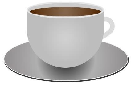
I added the this::after selector to generate another blurry shadow that will be displayed at the very bottom of this element.
.coffee-tasse::after{
    content: '';
    display: block;
    width: 405px;
    top: 68%;
    border-radius: 50%;
    height: 145px;
    background: transparent;
    box-shadow: 2px 5px 8px 3px #bababa;
}

That’s it ☕. Congratulations on making your first CSS art 🎉 – now it’s your turn to use all the things you have learned to make something fancier! 👏
If you want to see more of my CSS artwork, check out my twitter, I tweet a lot about CSS there. 😊
Free Resources
- undefined by undefined