How to create a simple drop-up with HTML and CSS
Overview
With
So, in this shot, we will be looking at how to achieve a drop-up menu like the one in this image below:
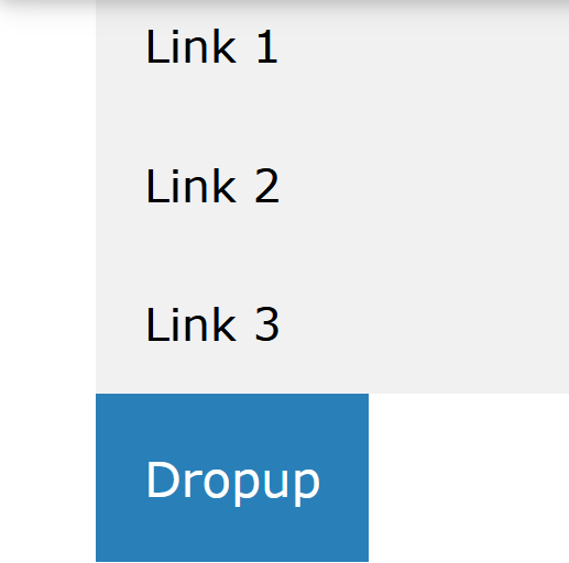
We will create this with HTML and CSS codes. If you hover your mouse over the button "dropup", it displays the content of the div, which holds the list items link1, link2 and link3 above the dropup button.
Creating a drop-up menu
Explanation
-
In the code, some
<p>tags were added to let us see the drop-up. -
A button was added and styled with a background color.
-
The
.dropupclass was given aposition: relativestyle. This is to let thedropup-contentbe placed on top of it usingposition: absolute. -
The
.dropup-contentclass which contains the actual drop-up menu is hidden by default using thedisplay: none, and it will be displayed upon hovering. -
The width of the
drop-contentelement set in the style can be adjusted to fit your taste, and if set to100%, it will have the same width as the drop-up button. -
Because there is a need for the drop-up menu to be in front of any content on the page, it was given a
z-indexof1. The box-shadow was used instead of the border to give the drop-up menu some form of depth to it. -
Finally, the
:hoverselector is used to show the drop-up menu when the user moves the mouse over the drop-upbutton.